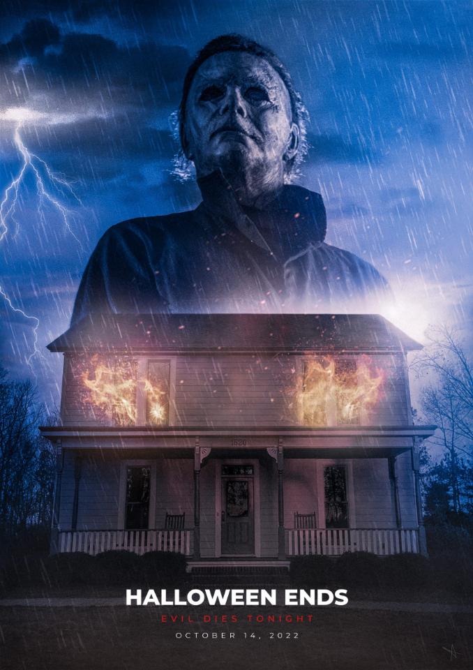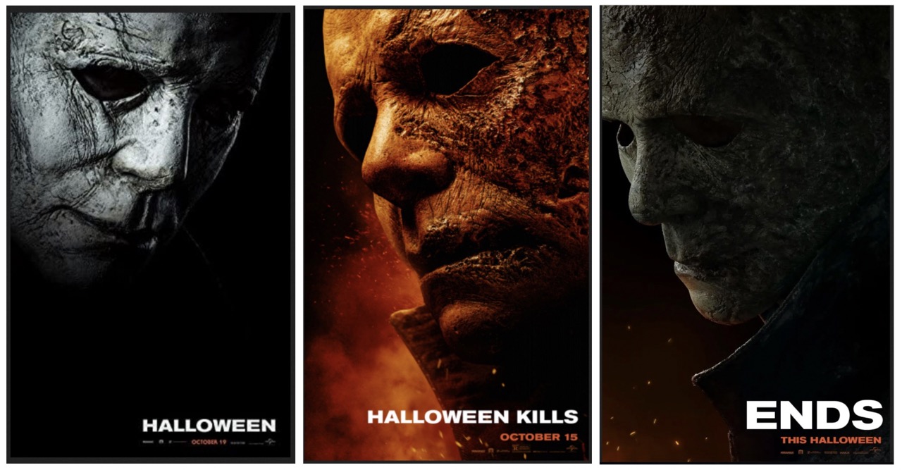
I put together the images for the film posters (I’m not sure if the ENDS poster is official, but it accompanied the trailer) and found a few things interesting. The artistic/directorial choices offer some interesting insight. I’m going to shoot from the hip and offer some thoughts because it’s the off-season and I haven’t had a good HalloweeN discussion in a while.
Let’s start with the color choices and see where that takes us.
2018 is basically black and white. Michael appears to be rising from the shadows. He looks ghostly like he’s risen from the dead… an apt analogy given the state of the franchise when DGG took over and his vision for bringing the story back to its 1978 roots. He quite literally raised the franchise from the depths of whatever it turned into over 40 years, and returned it to its origins.
TURD…whoops, I meant KILLS is mostly red and orange… very obviously a nod to the fact that Michael is left for dead in a burning house and now wears a half-melted mask. However, the red color also suggests anger, perhaps. Passion. Homicidal rage. It is a good indicator of how the film plays out. Michael on a rampage.
So, assuming we can glean some kind of tone or theme from the color choices used in the posters, how do the colors on the ENDS poster inform us? We see a heavy greenish color depicting Michael and the faint glow of the remnants of a fire. Super cool use of color here. Michael looks like death. The green color gives the mask a zombie vibe or a decaying, dead look. The embers glowing at the bottom suggests the fire is going out. A clear nod to the films title and main intention. The trilogy is coming to an end.
I want to point out the use of light as well. In both 2018 and TURD… damn it … KILLS, the source of light is on the viewer’s side of the mask. It is being illuminated from the front. In the ENDS poster the mask is backlit and creates, more or less, a silhouette of Michael. Again, a great use of imagery to suggest the story is coming to a close. Often, on stage and in film, we see silhouettes used to depict characters that are no longer present. The silhouette is an effective way to give the essence of a person, but nothing more. I’ll leave the rest up to you.
I also want to mention the actual source of the light is consistent in all 3 posters. It is to the left. In 2018 Michael is standing up. In TURDKILLS he has turned toward the source of light and is facing it head on. In ENDS he has looked back toward the shadow whence he came. More on that later…
This leads nicely into another thing I want to point out. In 2018 we see the mask is filled by someone. There is a subtle fleshy looking structure in the eye hole. In TURDKILLS the mask doesn’t have any noticeable human features beneath it, but it still looks very much filled by a person. There’s nothing there to suggest the mask is empty. However, in ENDS the mask looks very much empty. The way we are able to see the mask curve back through the eye hole suggests there is nothing inside of the mask, or what was there is gone or will be gone. Perhaps an empty mask suggests a need for something or someone to fill it? Again, I’ll leave the rest up to you.
Let’s keep going.
Remember how I said 2018 looks like Michael is rising from the shadows? In TURDKILLS he’s very much in your face and heavily illuminated. Also, clever devices like the embers, smoke plume, and the very forward-pointing collar all give the poster motion and give Michael a forward movement toward the light source. This captures the relentless forward motion of Michael’s rampage rather well. In ENDS, however, we see the opposite. Michael appears to be turning back toward the shadow… looking over his shoulder… more on that later.
Also, the way Michael is hidden behind his collar in ENDS is interesting as well. He’s far less aggressive looking in ENDS when compared to TURDKILLS. Body positioning and subtle changes in small things like collar position can have a huge change in how we interpret that body language. In TURDKILLS he’s clearly on the offensive… as I said, he’s very much in your face and predatory. In ENDS he’s obscured, heavily shadowed, and takes on a different look. Perhaps he looks more like prey. Read into that what you will.
I would be remiss if I didn’t mention camera angles as well. 2018 is mouth-level. We are slightly looking up at Michael. This and the slight tilt in the head suggests Michael is in the act of standing up. TURDKILLS we are chin, maybe throat-level, we are very obviously looking up at Michael. This gives Michael a dominating presence. In ENDS the camera is slightly higher than brow-level. We are actually looking down at Michael. This lessens his domineering presence quite significantly. This also lends to the idea that he looks less aggressive and predatory. It gives him a very slight look of vulnerability.
So, when we put all of that together what do we get when trying to interpret the poster for the upcoming film?
Perhaps, something is lurking in the shadow of Michael Myers. Something he did not expect. In ENDS we see Michael has turned to look over his shoulder. For the first time we are seeing Michael as a target rather than the weapon.
Something is coming for the Boogeyman.
Wow. Talk about conjecture.
Well, there you go.
Best,
HEDGE