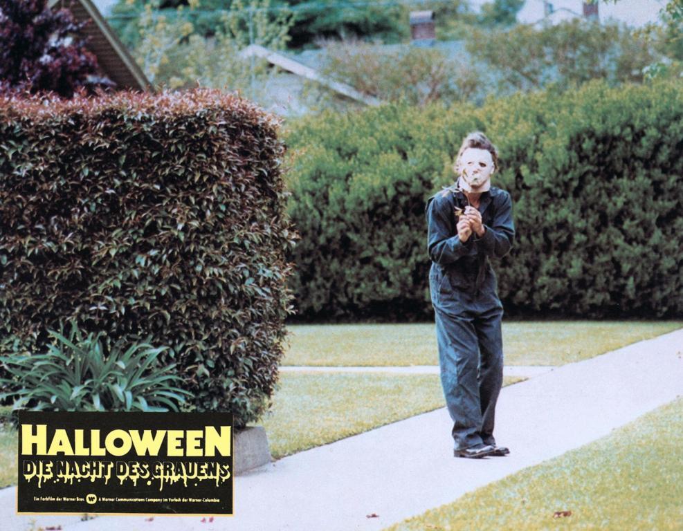
It really is a strange color!. If you think about the olive wood vs blue, the olive wood would surely be movie accurate, but I guess the blue would be accurate for the naked eye if you see it live. Crazy shit ![]()
![]()
I’ve owned many different colors but for me Olivewood has been the closest, just a personal opinion to what I see in the daylight shots in Halloween.
I personally love how navy blue looks!
Agree 100%. Especially in the getting in/out of car shots, and the SY scene!
It took me probably until age 10 or 11 to tell that they weren’t blue or a blueish color. Hell, I thought Roy’s coveralls in F13th 5 were blue up until Precarious pointed that out. Now when I watch it, all I can see is green! Crazy how the mind plays tricks on you like that.
Sent from my iPhone using Tapatalk
Great to get some personal views on them when you’ve had different colors ![]() . What are your take on the colors during night time or more dark environments
. What are your take on the colors during night time or more dark environments ![]() ?
?
Now you’re playing with my eyes haha. I seriously think that these look green with a little blue to it ![]()
That’s interesting, they look full blue to me
Well at least I’m sure that when I’m gonna get some coveralls for a future Michael Myers look, I’m not gonna go with pink ![]() . The blue and green seriously play tricks on my eyes with these pictures.
. The blue and green seriously play tricks on my eyes with these pictures.
These are my Montgomery Ward coveralls that I dyed. This has always been what I called “Olivewood”
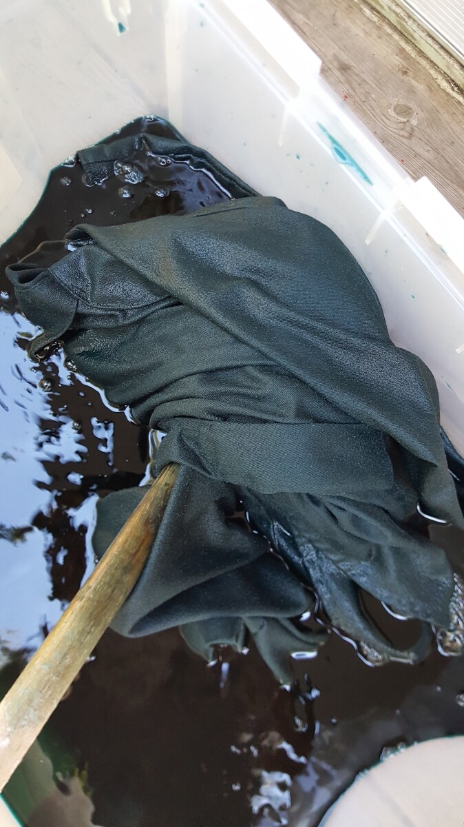
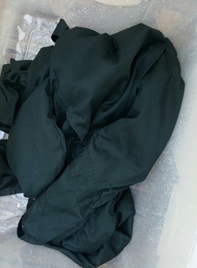
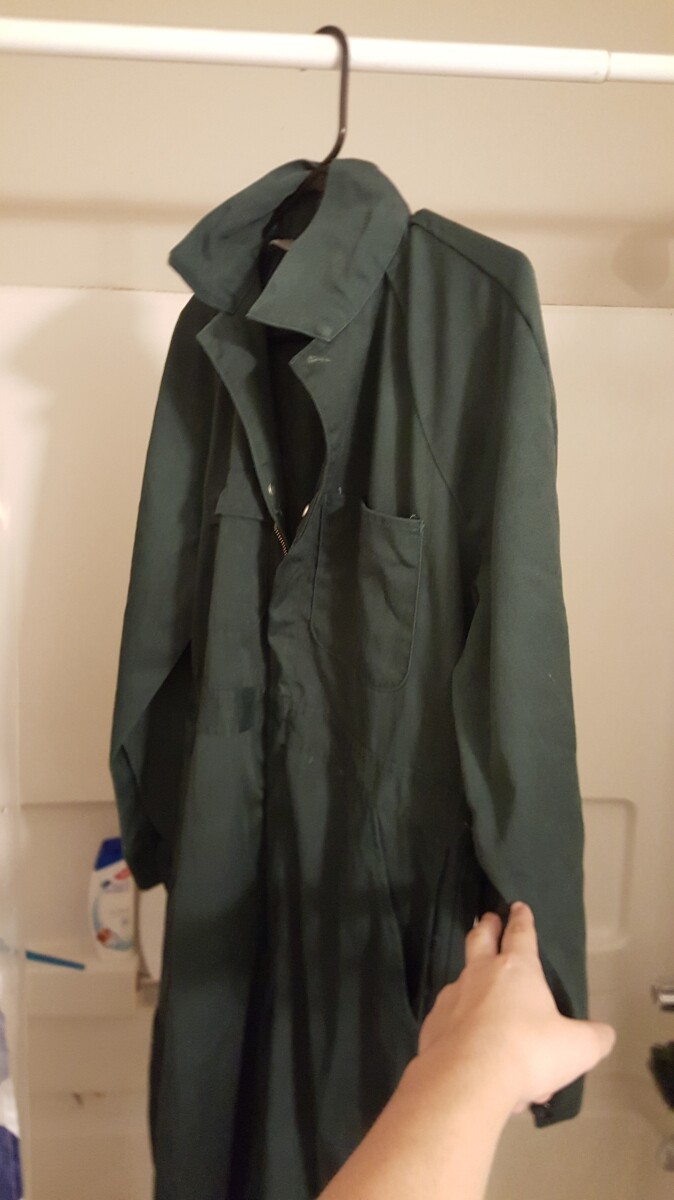
All great points fellas. Those Montgomery Wards are almost identical in spec wise to the Big Macs that color you dyed them is more of a spruce green rather than the Olivewood.
I did some lighting tests outside tonight with my DSLR in daylight with 3 different white balances. Olivewood is King ![]() post them later tonight!!
post them later tonight!!
Mine are pretty similar to spruce green, but they have alot more of a gray-ish tint. Not perfect, but about 90% similar I’d say. I absolutely HATE how cameras never pick up on the color you’d see with your naked eye
Edit: Can’t wait to see the pics btw!


Thank you ![]() coming this October
coming this October ![]()
Awesome pictures! You always pull off a great ‘Castle’ look!
BTW what mask is that you are wearing?
As far as the actual color of the coveralls goes, there’s still the question of whether to go with the actual color or how the color appeared on screen.
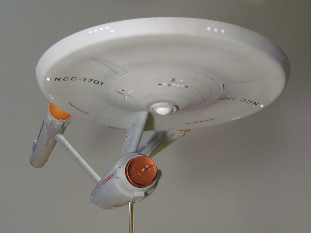
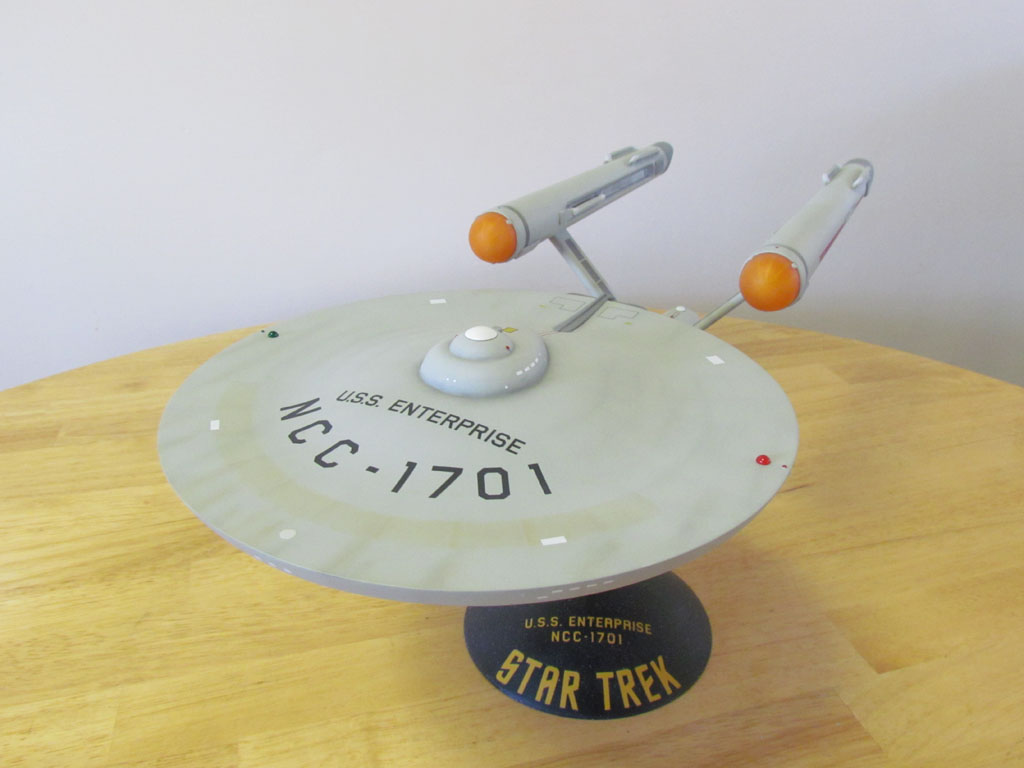
I’m also a fan of Star Trek and I build models. There’s been many discussions regarding the color of the 11 foot studio model of the original Enterprise. It appears neutral grey, white, silver, blue-ish, green-ish… on screen. In fact the actual color of the studio model was a green-ish gray.
I built a model of the Enterprise a few years ago and painted it a slight greenish-gray color since I wanted the studio model look. In these 2 pictures under different lighting it looks green-ish gray in one and more of a warm neutral gray in the other. The color I used has a slight green color shift but in daylight it’ll appears a neutral gray.
The other thought is what did the director intend the object(Michael Myers coveralls, Enterprise…) to look like on screen. Sometimes a certain color is used so under certain lighting and depending on what film stock was used the desired color can be achieved on screen.
It all comes down to what looks best to the individual. I personally see Michael Myers coveralls as looking dark blue. I know it’s the lighting making them appear dark blue but I’ve also never seen the actual coveralls in person so to me they look dark blue. When I get around to getting a pair I might go with dark blue so in person they’ll look like they appear on screen.
A very good view on the subject. I think that’s what it comes down too as well. People will always chase the brand, Real color etc etc but to the untrained fan who comes and visits and sees a lifezise or this or that. They will go… green?.. the movie goers see see a dark navy blue that’s faded to hell with stains all over it lol h2 is Spruce but they look almost black on screen.
I’ve been in these same discussions regarding the color of the Enterprise and some other subjects as well. The subject matter is different but the idea is the same. I feel sometimes a color that an object actually is won’t look right since it looks like a different color on screen. Even the Michael Myers figures that have been sold all seem to have blue coveralls. I have a feeling dark blue is the intended color John Carpenter was after on screen.
I have the exact same coveralls! Good to see what they’d look like in the right lighting
So I do have the accurate! Greyish Green! ![]()
Sprucegreen Reeds Dyed with Grey and Black

Gesendet von meinem SM-A310F mit Tapatalk