What a great conversation and the only place we could have it!
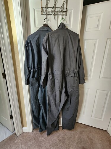
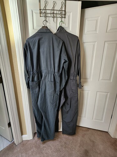
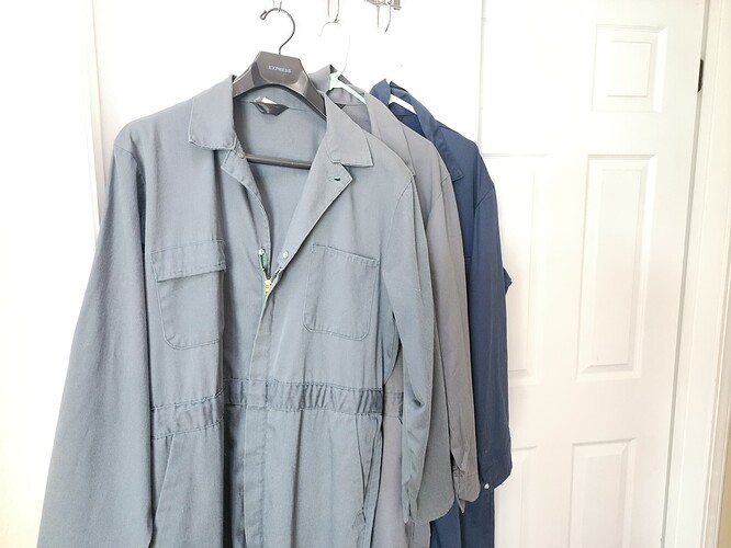
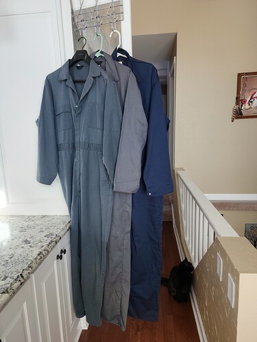
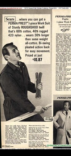
I too was bitten by the coverall bug last year and have various models of Sears with varying pockets and colors.
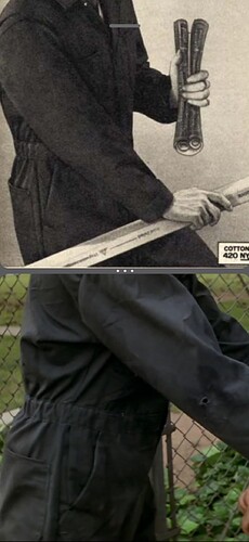
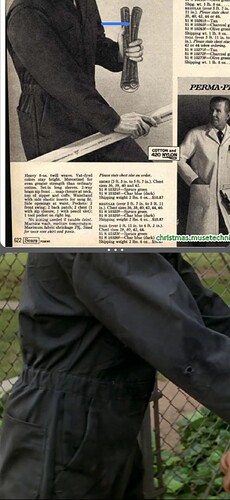
I’ve seen a lot of variations with pocket shapes, colors, snap locations, etc.
The power of weathering and lighting is huge, as well as dye variations and the effects of fading and washing. I know my coveralls look much different after I add just light weathering.
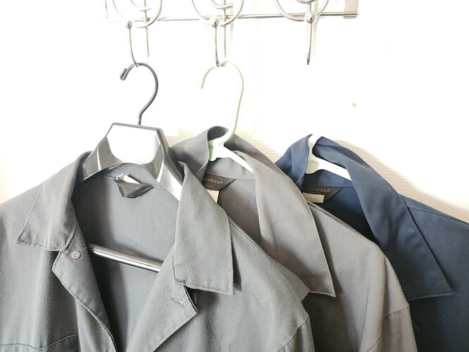
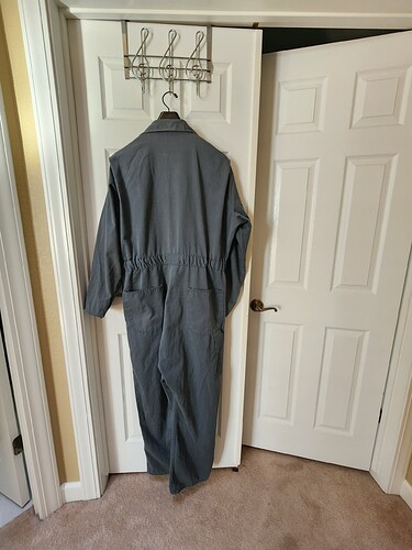
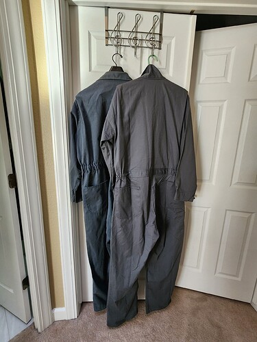
I’ve seen some red tag Sears coveralls with square pockets, some Tradewears with a seam on the center back, and I also think they just slapped whatever collar tags they had on near transition times when they changed tags or logos.
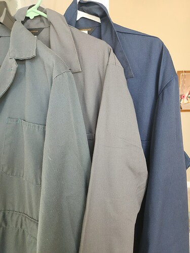
I will say that as most do, I recall the coveralls looking mostly navy blue in H1 (except for the outdoor scenes where they seem dark/olive green) and almost a grey navy in H2 (even though we know they were green).
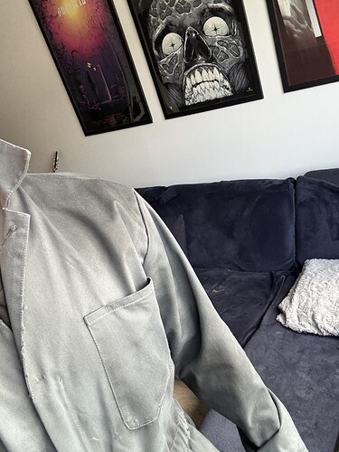
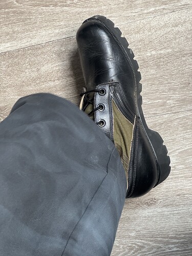
Every greenish pair of coveralls I bought on ebay looked grey in the pictures, and they look grey when I photograph them as well.
I think a big part of it for me is that most greens look wrong IN PERSON unless they are very weathered and stained. Gray or dark blue tends to look “right” for a costume.
You also have to consider what you are going to do or looking for- if you’re going to conventions and in person events, something closer to blue would look for accurate to what we see on screen, while using greenish/tex will produce better results on film and camera.
I’ve heard the term “Screen-accurate” used a lot incorrectly. “Screen Accurate” is how stuff looks in the movie theatre or on a screen, NOT what was actually used on the set. That is “prop accurate” or “set accurate”.
So screen accurate to H1 would be a tone of blue for every scene EXCEPT the outdoor scenes where they look grey or green, depending on your screen settings and movie version.
Set accurate would be the Tex Green (or whatever was actually used).
A good example of this is Batman’s Batmobile in the 1989 Michael Keaton movie: the actual paint had a holographic oil/beetle effect (set accurate) while on screen the paint looked satin black (screen accurate).
